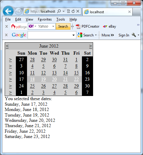
You can use this control to create a functionally rich calendar box which shows one month at a time. The end user can move from month to month, select a date, and select a range of days when the multiple selections are allowed. You can change almost every part of the Calendar control by using its properties. The Calendar also provides events that enable you to react when the user changes the current month (VisibleMonthChanged), when the user selects a date (SelectionChanged), and when the Calendar is about to render a day (DayRender).
In the next example Calendar tag sets a few basic properties:
<asp:Calendar runat=”server” ID=”Calendar1″ ForeColor=”yellow” BackColor=”blue” />
SelectionChanged is the most important Calendar event. It fires every time a user clicks a date. The next example shows a basic event handler that responds to the SelectionChanged event and displays the selected date:
protected void Calendar1_SelectionChanged(object sender, EventArgs e)
{
lblDates.Text = “You selected: ” + Calendar1.SelectedDate.ToLongDateString();
}
Important notes:
1. The Calendar does not use the AutoPostBack property.
2. You can react to the selection event immediately, because every user interaction with the calendar triggers a postback.
3. You can allow users to select entire weeks or months, or you can render the control as a static calendar that does not allow selection.
4. If you allow month selection, the user can also select a single week or a day.
5. If you allow week selection, the user can also select a single day.
In case when you set Calendar.SelectionMode to something other than a Day, you should examine the SelectedDates property instead of the SelectedDate property. The next example shows how you can examine SelectedDate property:
protected void Calendar1_SelectionChanged(object sender, EventArgs e)
{
lblDates.Text = “You selected these dates:<br />”;
foreach (DateTime dt in Calendar1.SelectedDates)
{
lblDates.Text += dt.ToLongDateString() + “<br />”;
}
}
The Calendar control exposes many more formatting-related properties, many of which map to the underlying HTML table representation (such as CellSpacing, CellPadding, Caption, and CaptionAlign). Additionally, you can individually tweak portions of the controls through grouped formatting settings called styles (which expose color, font, and alignment options). Example properties include DayHeaderStyle, DayStyle, NextPrevStyle, OtherMonthDayStyle, SelectedDayStyle, TitleStyle, TodayDayStyle, and WeekendDayStyle. You can change the sub-properties for all of these styles using the Properties window.
You can completely change the appearance of the cell being rendered by handling the DayRender event. This event allows you to tailor what dates are selectable and to configure the cell where the date is located through the e.Cell property. The next example shows how you can use the event to change the background and foreground colors of the weekend days and also to make them non-clickable for the user:
protected void Calendar1_DayRender(object sender, DayRenderEventArgs e)
{
if (e.Day.IsWeekend)
{
e.Cell.BackColor = System.Drawing.Color.Black;
e.Cell.ForeColor = System.Drawing.Color.White;
e.Day.IsSelectable = false;
}
}
The next picture shows the result:

